2009-10
Mejiro Kindergarten; Wada Minoru Gakuen, Mejiro, Tokyo
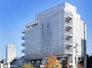
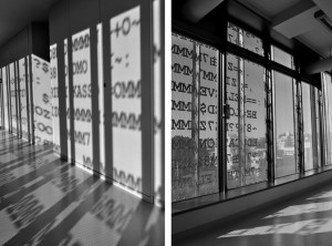
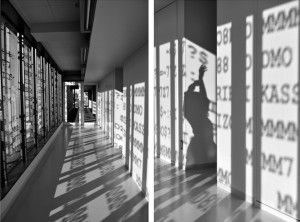
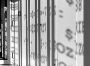
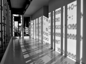
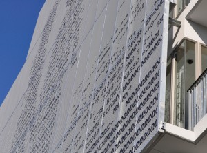
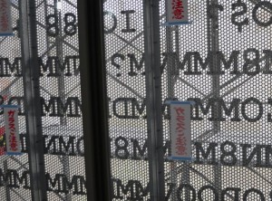
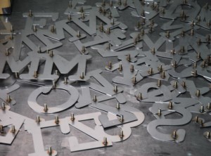
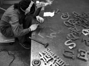
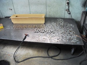
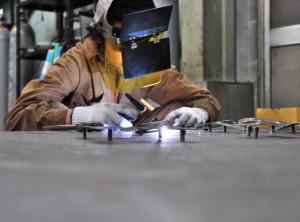
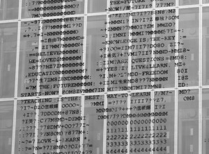
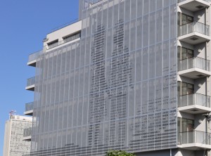
3000 stainless steel letters, punched aluminum panels
20 x 30 meters
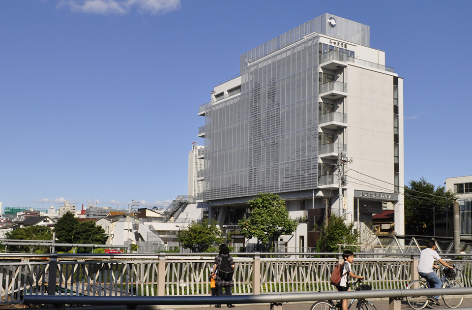
THE SITE
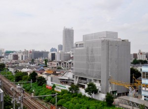
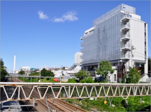
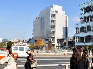
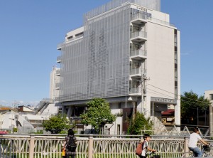
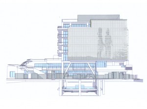
Wada Minoru Gakuen (Mejiro Institute of Education and Child Development), A new learning institution in Mejiro, Tokyo’s prestigious Ivy League academic district. The building is directly in front of the train station (Mejiro, Yamanote Line) and opposite the Royal Gakshuin University where the Emperor’s children attend. The school is a combination effort of education for teachers and children between the ages of 3-6 years old. The top 5 floors of the building are dedicated as a learning centre for teachers that will implement the new semi radical structure reform of the Japanese education system. The objective is to eliminate common curriculum from early education and concentrate on fertilisation of free thinking and experimentation that nurtures the individual learning process, in opposition to the current didactic approach implemented as the standard. Considering Japan’s infamous archaic education system, I was drawn to the idea of radical progression in Education and being a part of creating something so effective and affective.
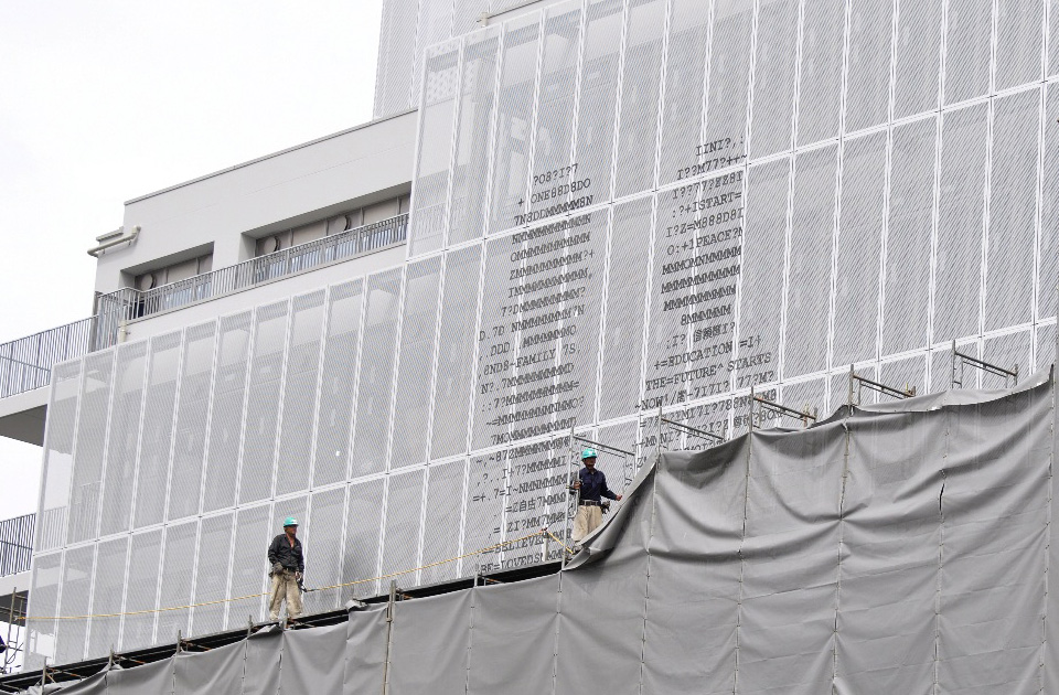
THE ASSIGNMENT
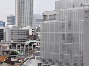
For this work, I was commissioned to work with the respected material specialist architect Mr. Suguru Koda of K & Factory (Japan) to create the façade of the building. It was going to be a permanent public piece that would exist on a timeless plane as well as carry a stimulating daily presence. The artwork would be interacting with millions of daily commuters from the passing train lines and the adjacent station, along with the constant pedestrian and automobile traffic at the major intersection. I felt compelled to create a piece that would encompass all of these attributes of the environment and in effect not get “boring” for those passing the pieces or the attendants of the building facilities. While also using an image that reflected the essence of the structure both internal and external with an aesthetic that would blend in to the environment as well as create a new one.
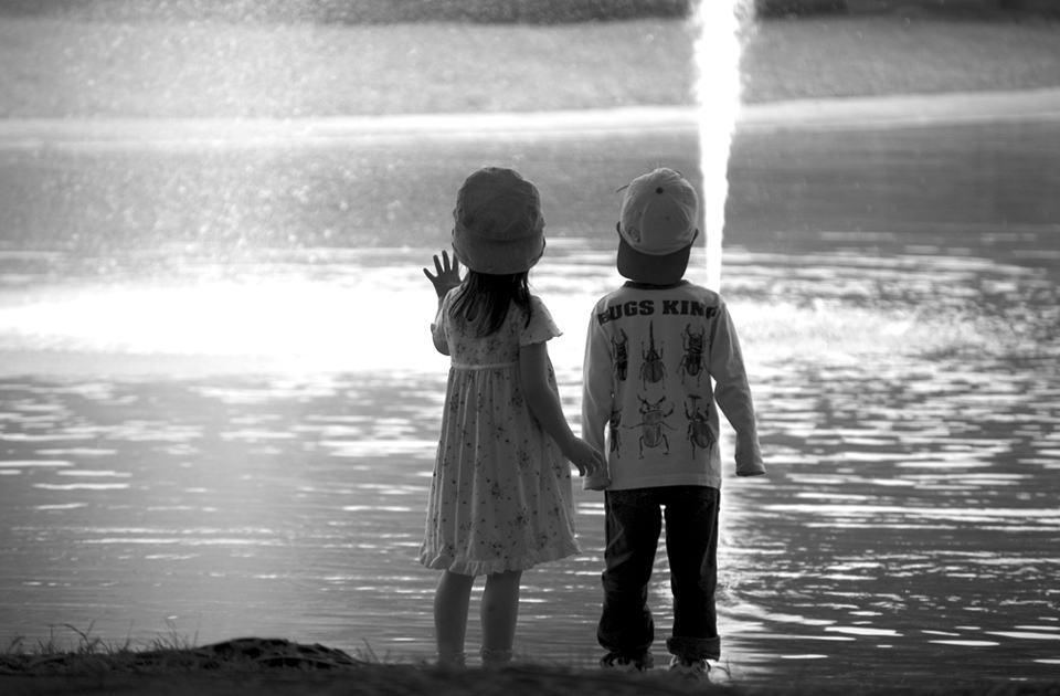
THE IMAGE
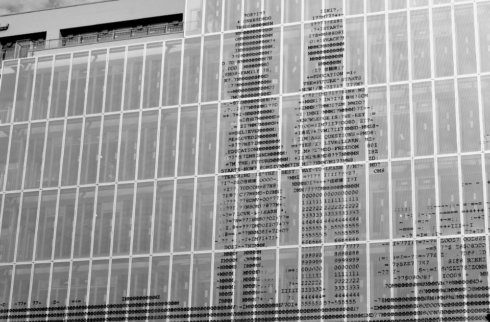
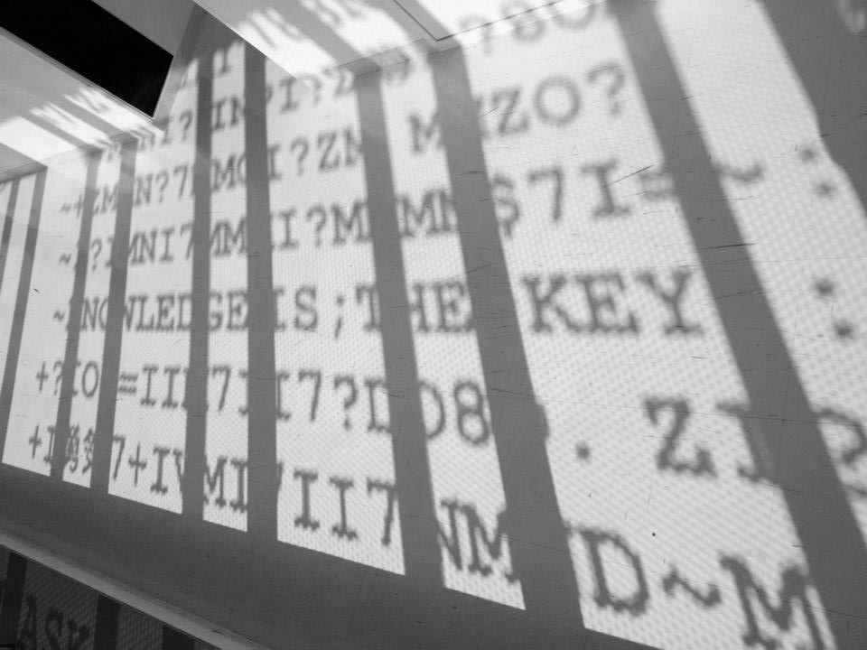
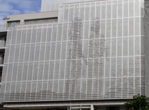
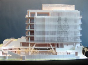
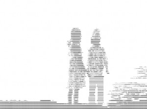
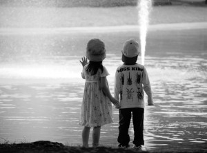
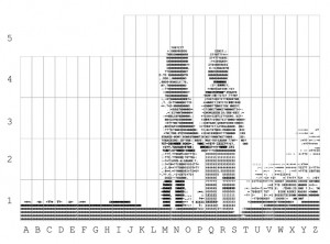
I immediately thought of a photograph of mine of 2 children holding hands reaching in to an emptiness I had taken a few years previous at Yoyogi Park, here in Tokyo. Also at the time I had been fascinated with ASCII art from the 1980’s; I loved the idea of translating an image in to a language. It was literally the future where instead of “a picture is worth a thousand words” now the picture was a thousand words . With the ASCII art work I began to imagine it as a refrigerator alphabet magnets that I had as a child, stuck on the face of a building. As I thought more into it, it became clear that this text in digital form also known as a “font” was also a brand new language that children will grow up with as an automatic second written language. A “Neo-Neanderthal” age where symbols and icons are used to reform communication. Within these text symbols are messages in English and Japanese such as “Teaching is the Best Way to Learn”; “The Future Starts Now”; “Live, Love, Learn” and other such thought provoking words and phrases. The composition of the children’s legs are composed of numbers, representing the foundation of numerics that is present in all languages. The numerical language is the fundamental guideline of this generations’ communication through the 0s & 1s of our technology.
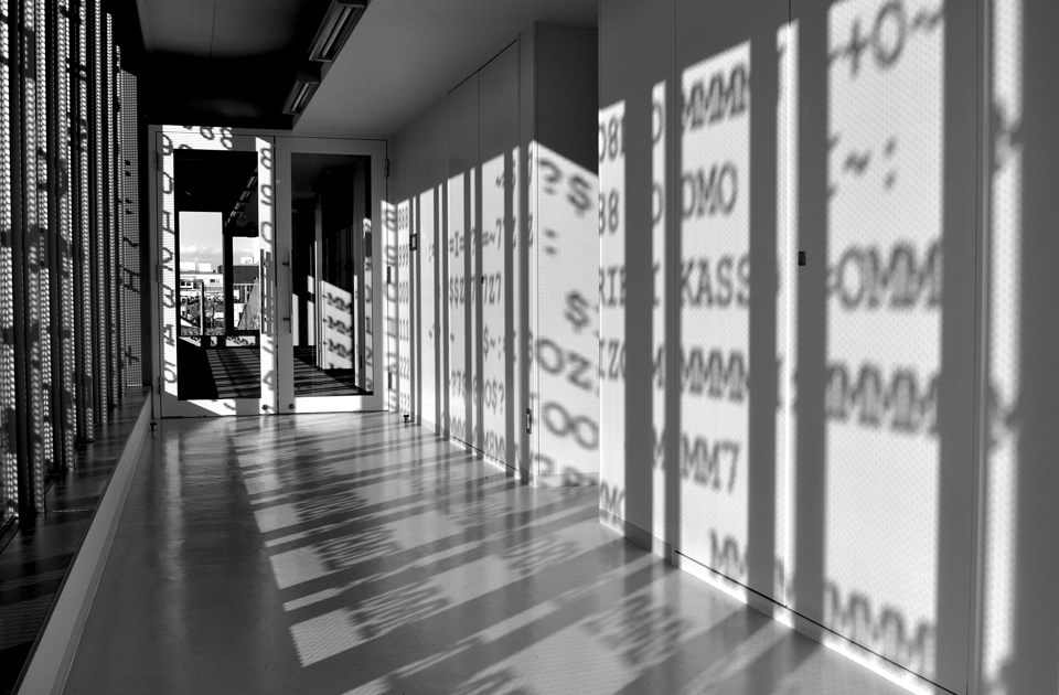
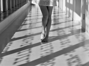
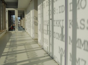
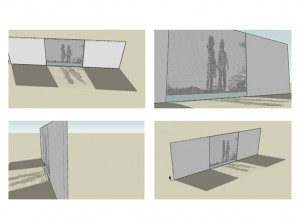
Within that spectrum, the concept of an image or idea of evolving was even more relevant. What started as a photograph had evolved out its current form in to new dimensions, first becoming the arbitrary two dimensional image we know as language alphabets, than becoming a three dimensional form that would create an existing and non existing space in the form of stainless steel and shadows. Using the available light from the sun according to the season, the shadows of the interior would rotate as the year passes defining a new space between the 3 dimensional object of the steel letters visible through the windows and the shadows casted on the wall. So in effect, people would travel through these passages of communication base on technology and predicted by nature. The font used in the piece is an original courier font that was popularised by the typewriter which naturally evolved in to the personal computers we use today,(and used to realise this artwork. The Future Starts Now is a combination effort of creativity, technology, innovation, man power, and nature in a supreme cooperation to create a more engaging landscape that inspires all.

Leave A Comment